Data normalization and analysis in multiple TMT experimental designs
MaxQuant processing of mouse lens data
Phil Wilmarth, OHSU PSR Core, March 2018
Overview:
Many factors make data analyses challenging in experiments where more than one set of isobaric tag reagents are used. Even with up to 11 reagents available, many experiments require more replicates/conditions than can fit in one labeling.
Any series of complicated measurements is never going to be perfect. There will be many sources of variation in addition to the biological differences between groups. Are the measured differences between groups due to the biology or the other sources of variation? There are many methods for removing unwanted sources of variation such as inaccuracies in protein assays and pipetting errors. These are collectively known as normalization methods.
The underlying concept behind normalization is that some samples (such as technical replicates, or biological replicates within one group) should be similar to each other based on some criteria. If these samples are not as similar as they should be, that extra variance may obscure the biological differences we are trying to see. If we can devise schemes and algorithms to make these similar samples more similar without removing or affecting biological differences, we can improve the power to measure what we set out to measure.
A misconception in data normalization is that complicated, multi-step procedures will require just one normalization step. In TMT labeling, there is supposed to be the same amount of digested protein labeled for each channel. The liberated reporter ion signals are our proxies for protein abundance, so the sum of the reporter ions in each channel is a proxy for the total amount of protein. The total signal per channel can be checked for consistency. Despite careful protein assays and bench steps, the measured signal totals are seldom identical and will typically require adjustments during data analysis. We will see below how the random sampling selection of peptides for MS2 analysis makes multiple TMT experiments difficult to combine without using a special IRS correction procedure (a specialized TMT normalization).
Once we get to a table of protein expression values for a set of biological samples, we may still have compositional bias that needs to be corrected. Since we process similar total amounts of material (protein or mRNA), changes in expression of a small number of highly abundant proteins can make all of the rest of the protein appear to be down regulated. Depending on your point of view, the data can be a few abundant proteins increasing in expression and other proteins being unchanged, or a large number of proteins decreasing in expression and a small number of abundant proteins being mostly unchanged. There are additional normalization methods, such as the trimmed mean of M values (TMM), developed for RNA-Seq data, that can remove compositional bias:
Robinson, M.D. and Oshlack, A., 2010. A scaling normalization method for differential expression analysis of RNA-seq data. Genome biology, 11(3), p.R25.
There are many experimental and analysis steps in these complicated measurements, and many have implicit or explicit associated normalizations. There are many software normalization algorithms that have been used in proteomics and an even larger number that have been developed for genomics. One strategy is to make the "size" of every sample the same since an equal amount of mRNA or protein is usually processed for each sample. Another strategy is to take something specific and make that "the same" between each sample. These "landmarks" can be the levels of housekeeping genes, the average or median signal, or the average or median expression ratio. These normalizations typically use a single multiplicative factor to adjust the samples to each other.
In genomics, platform variability is well known, and this can result in rather interesting distortions between datasets that are referred to as "batch" effects. In many cases, these distortions can be recognized and corrected with specific "batch correction" methods (e.g. ComBat). Alternatively, some statistical packages can incorporate batches into their models and that may perform better.
We are not doing a review of all possible normalization methods, though. We just want to learn how to analyze experiments using isobaric labeling when the study design needs more than 10 or 11 samples, and multiple TMT experiments have to be combined. We will thoroughly explore how to analyze these experiments using the internal reference scaling (IRS) methodology that was first described in this publication:
Plubell, D.L., Wilmarth, P.A., Zhao, Y., Fenton, A.M., Minnier, J., Reddy, A.P., Klimek, J., Yang, X., David, L.L. and Pamir, N., 2017. Extended multiplexing of tandem mass tags (TMT) labeling reveals age and high fat diet specific proteome changes in mouse epididymal adipose tissue. Molecular & Cellular Proteomics, 16(5), pp.873-890.
Plubell, et al. introduced a novel normalization methodology (IRS) capable of correcting the random MS2 sampling that occurs between TMT experiments. Analytes are sampled during their elution profile and the measured reporter ion signal intensity depends on the level of the analyte at the time of the sampling. This process can be modeled as a random sampling process:
Liu, H., Sadygov, R.G. and Yates, J.R., 2004. A model for random sampling and estimation of relative protein abundance in shotgun proteomics. Analytical chemistry, 76(14), pp.4193-4201.
The random MS2 sampling affects the overall intensity of reporter ions, but not their relative intensities. The relative expression pattern of reporter ions is robust with respect to MS2 sampling. This random sampling creates a source of variation that is unique to isobaric tagging experiments. As we will see below, failure to correct for this source of variation makes combining data from multiple TMT experiments practically impossible.
Example dataset:
When testing new methodologies, it is nice to work on a dataset where something is already known, and some assumptions can be made. This paper is a developmental time course study of mice lens and has publically available data:
Khan, S.Y., Ali, M., Kabir, F., Renuse, S., Na, C.H., Talbot, C.C., Hackett, S.F. and Riazuddin, S.A., 2018. Proteome Profiling of Developing Murine Lens Through Mass Spectrometry. Investigative Ophthalmology & Visual Science, 59(1), pp.100-107.
There are 6 time points (E15, E18, P0, P3, P6, and P9), each three days apart, that were TMT labeled (6 channels in each experiment). There were many lenses pooled at each time point and the experiment was repeated three times as three separate TMT experiments. The instrument was a Thermo Fusion Lumos and the SPS MS3 method was used to get cleaner reporter ion signals.
There were no common internal reference channels present in the three TMT experiments. In the publication by Plubell, et al. where the IRS method was first described, duplicate channels of the same pooled reference mixtures were run in each TMT experiment and used to match the protein reporter ion intensities between TMT experiments. That is the preferred experimental design. We will try and "mock up" a reference channel for each TMT experiment and perform a mock IRS method.
These are inbred laboratory mice and there are several lenses pooled at each time point in each TMT experiment. We can expect the three replicates at each time point to be pretty similar to each other (assuming good sample collection and processing). The same set of 6 time points were in each TMT experiment so this is a balanced experimental design. If we average all 6 time points in each TMT experiment, this should be a good mock reference channel to use in the IRS procedure.
We know a lot about mouse lenses from years of study. The central part of the lens is composed of fiber cells that contain a dramatic over-expression of a small number of lens-specific proteins called crystallins. Fiber cells are not metabolically active, no longer have organelles, and there is no cellular turnover in the lens. There is a monolayer of metabolically active epithelial cells on the anterior face of the spherical shaped lens. There is an outer region of the lens, called the cortex, where the cells undergo differentiation from epithelial cells to mature fiber cells. One simple model of lens protein expression with time is that the complement of cellular proteins from the epithelial cells (and some cortical cells) will be progressively diluted out by the accumulated crystallins. In mature lenses, the crystallins make up roughly 90% of the lens.
The data from the above publication was downloaded from PRIDE and processed with MaxQuant version 1.5.7.4 (version 1.6.1.0 kept crashing so an older version of MQ was used). The MS3 experiment type was selected with 10-plex TMT reagents, and a reporter ion integration tolerance of 0.003 Da. Other parameters were the usual MQ defaults. The protein database was a canonical mouse reference proteome from UniProt.
Cox, J. and Mann, M., 2008. MaxQuant enables high peptide identification rates, individualized ppb-range mass accuracies and proteome-wide protein quantification. Nature biotechnology, 26(12), p.1367.
The proteinGroups.txt file was loaded into Excel so that several filtering steps could be performed and that just the relevant reporter ion data could be exported as a CSV file. The file "MQ_data_prep_steps.txt" details the Excel steps. Contaminants and decoys were removed. Proteins where there were no data in one or more of the 3 TMT experiments were removed. Unused TMT channels (4 per experiment) were removed. There were 3868 proteins saved as a CSV file for importing into R. The 18 (3 by 6) reporter ion columns and a column of protein accessions were exported.
More info about Jupyter notebooks
This document was created as a Jupyter notebook. Notebooks have text cells (markdown), code cells (supports many languages), and output cells that support nice graphics.
Alternative ways to make documents like these are using R markdown in RStudio. Jupyter can also be used with Python and I find that Jupyter notebooks are a little easier to use. Your milage may vary...
Load libraries and the dataset:
R libraries will need to be installed before loading the dataset. We will only work with proteins where reporter ion values were observed in all 3 experiments. This filtering was done in Excel prior to the R analysis. We will allow at most one missing TMT channel in each TMT experiment so we will have to do some replacement of zeros by a small value so we can do log transformations.
# Analysis of IOVS mouse lens data (Supplemental Table S01):
# Khan, Shahid Y., et al. "Proteome Profiling of Developing Murine Lens Through Mass Spectrometry."
# Investigative Ophthalmology & Visual Science 59.1 (2018): 100-107.
# load libraries
library(tidyverse)
library(limma)
library(edgeR)

#read the Supplemental 01 file (saved as a CSV export from XLSX file)
data_raw <- read_csv("MQ_prepped_data.csv")

# save the annotation columns (gene symbol and protein accession) for later and remove from data frame
annotate_df <- data_raw[19]
data_raw <- data_raw[-19]
row.names(data_raw) <- annotate_df$Accession

# take care of the zeros in MQ frame
data_raw[data_raw <= 1] <- 5
What do the raw (un-normalized) data distributions look like?
We will use box plots, a common way to summarize distributions, and distribution density plots to visualize the Log base 2 of the intensities. The 6 samples from each TMT experiment are the same color and the three TMT experiments are in different colors:
# let's see what the starting MQ data look like
boxplot(log2(data_raw), col = rep(c("red", "green", "blue"), each = 6),
        notch = TRUE, main = "RAW MQ data: Exp1 (red), Exp2 (green), Exp3 (blue)")

# can also look at density plots (like a distribution histogram)
plotDensities(log2(data_raw), col = rep(c("red", "green", "blue"), 6), main = "Raw MQ data")


Do we need to do some data normalization?
Let's check the total signal in each channel for the 18 samples (below). We have significant differences that we can correct with some basic normalizing. There was supposed to be the same amount of protein labeled in each sample. We should have the total signals in each channel summing to the same value. We can average the numbers below and compute normalization factors to make the sums end up the same.
format(round(colSums(data_raw), digits = 0), big.mark = ",")
We have significant differences that we can correct with some basic normalizing. Experiment 3 had lower total intensities than the other two. There was supposed to be the same amount of protein labeled in each sample. We should have the total signals in each channel summing to the same value. We can average the numbers below and compute normalization factors to make the sums end up the same.
# separate the TMT data by experiment
exp1_raw <- data_raw[c(1:6)]
exp2_raw <- data_raw[c(7:12)]
exp3_raw <- data_raw[c(13:18)]

# sample loading (SL) normalization adjusts each TMT experiment to equal signal per channel

# figure out the global scaling value
target <- mean(c(colSums(exp1_raw), colSums(exp2_raw), colSums(exp3_raw)))

# do the sample loading normalization before the IRS normalization
# there is a different correction factor for each column
norm_facs <- target / colSums(exp1_raw)
exp1_sl <- sweep(exp1_raw, 2, norm_facs, FUN = "*")
norm_facs <- target / colSums(exp2_raw)
exp2_sl <- sweep(exp2_raw, 2, norm_facs, FUN = "*")
norm_facs <- target / colSums(exp3_raw)
exp3_sl <- sweep(exp3_raw, 2, norm_facs, FUN = "*")

# make a pre-IRS data frame after sample loading norms
data_sl <- cbind(exp1_sl, exp2_sl, exp3_sl)

# see what the SL normalized data look like
boxplot(log2(data_sl), col = rep(c("red", "green", "blue"), each = 6),
        notch = TRUE, main = "Sample Loading (SL) normalized data: \nExp1 (red), Exp2 (green), Exp3 (blue)")

# can also look at density plots (like a distribution histogram)
plotDensities(log2(data_sl), col = rep(c("red", "green", "blue"), 6), main = "SL normalization")


# check the columnn totals after SL norm
format(round(colSums(data_sl), digits = 0), big.mark = ",")
Correcting for sample loading helped, but medians are still not aligned
The numbers above show that the sample loading (SL) normalization did make the totals the same. However, we still have a systematic decrease in median value as a function of developmental age within each TMT experiment. This makes sense for this system because we know that the lens will have greater and greater amounts of highly abundant crystallins as the lens matures. This will dilute the proteins originating from the epithelial cells and cortex. We expect the signal for the median protein, which will not be one of the over-expressed lens proteins, to decrease. This might be a situation that the TMM normalization was designed to correct. Let's find out.
# do TMM on raw data - we use it later for CV analysis
raw_tmm <- calcNormFactors(data_raw)
data_raw_tmm <- sweep(data_raw, 2, raw_tmm, FUN = "/") # this is data after SL and TMM on original scale

# see exactly what TMM does with SL data
sl_tmm <- calcNormFactors(data_sl)
data_sl_tmm <- sweep(data_sl, 2, sl_tmm, FUN = "/") # this is data after SL and TMM on original scale

boxplot(log2(data_sl_tmm), notch = TRUE, col = rep(c("red", "green", "blue"), each = 6),
        main = "TMM normalization of SL data\nExp1 (red), Exp2 (green), Exp3 (blue)")

# can also look at density plots (like a distribution histogram)
plotDensities(log2(data_sl_tmm), col = rep(c("red", "green", "blue"), 6), main = "SL/TMM normalization")


TMM normalization aligns the "centers" of the distributions
The box plots show that TMM normalization performs as expected and makes the centers of the distributions more similar. However, the column sum numbers below are now different (as might be expected), showing an increase with increasing developmental time (crystallin over-expression). It should be pointed out that it is not obvious whether SL normalization alone is the better view of a developing lens, or if the compositional correction of TMM is more appropriate. One or both methods may be useful.
Different ways to view how similar the samples are to each other give us different insights. After TMM normalization, the box plots look very similar. The density plots indicated that are still some aspects of the data that are not yet the same (some wiggles and dips). We can assume that the lens proteomes will differ significantly over this time course. This is an active range of early mouse development. There are many lenses pooled for each time point and inbred mice are quite similar so we can expect that the biological replicates at each time point should be similar. We would, therefore, expect our samples to cluster by developmental times. Let's see if that is the case.
format(round(colSums(data_sl_tmm), digits = 0), big.mark = ",")
# see how things cluster after we have gotten the boxplots and desity plots looking nice
plotMDS(log2(data_sl_tmm), col = rep(c("red", "green", "blue"), each = 6),
        main = "SL/TMM clusters by TMT exeriment")

Houston, we have a problem...
Despite applying two sensible normalizations that greatly improved the box plot and density distributions, we have very strong clustering by TMT experiment. If we explored additional components in the multi-dimensional scaling, we would see the developmental time points grouping as expected. We know that isobaric labeling is very precise when comparing intensities from the same instrument scan. We know that the instrument selects eluting analytes in a random fashion. The clustering indicates that the differences between time points within a single TMT experiment are smaller than the differences between TMT experiments.
It is like the different TMT experiments are similar to batch effects in RNA-Seq experiments. In genomics experiments, the corrections for the batch effects are not independent of the data that is being tested for differential expression. This complicates batch corrections.
Internal reference scaling relies on there being something identical (or very similar) being measured in each TMT experiment. That is the "internal reference" part. A pooled sample made up of aliquots of protein from all samples in the experiment works particularly well. If we measure exactly the same protein sample in each TMT experiment, the set of protein intensities should be exactly the same (in a perfect world). IRS makes them the same and puts all of the reporter ions on the same "scale". Using two channels in each TMT to measure the internal standard is actually worth the extra channel because the average is a more stable. This experimental design has independent data for the correction factors so that the biological samples remain statistically independent. The diagram below outlines the procedure:
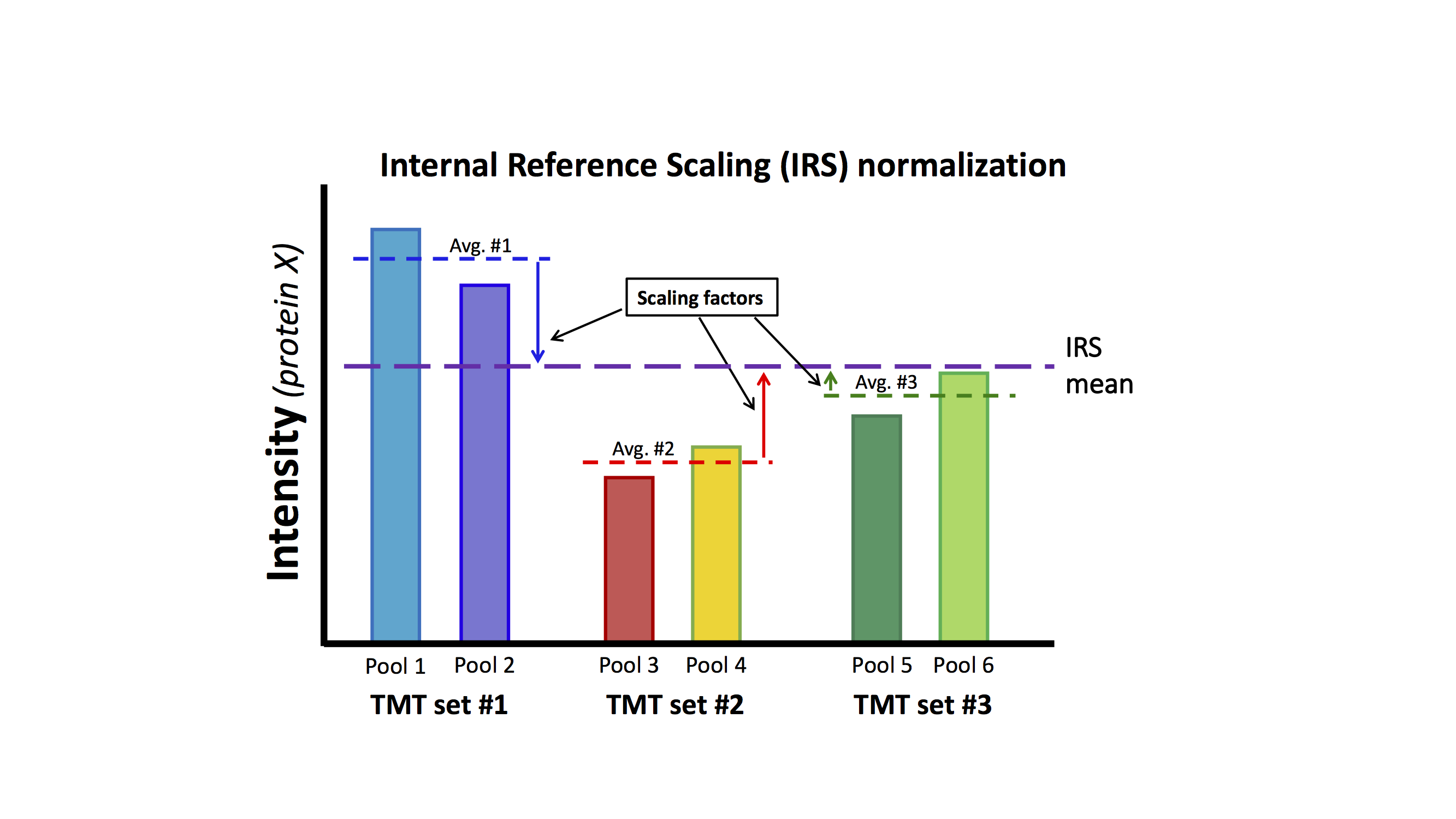
This mouse lens data set does not have the correct study design (common pooled standards) that was suggested in Plubell, et al. As was mentioned above, there are multiple mice lenses at each time point and inbred mice have low biological variability. The same collection of time points is in each TMT experiment so we have a balanced study design. We can safely assume that averaging over all time points in each TMT experiment should be a good proxy for a reference channel. We can perform the IRS method by creating a mock reference channel. For each TMT experiment, we will compute the reporter ion average over the 6 time points for each protein. For each protein, we will have 3 reference intensities, one from each TMT. We can compute the average reference intensity and compute 3 factors to adjust the reference value in each TMT experiment to the average. We will multiply that value for each TMT experiment times each of the 6 reporter ion channels for that TMT experiment.
Each TMT experiment gets its own correction factors independently for each protein. Each protein is corrected between the three TMT experiments independently of all other proteins. There is no modeling in the procedure. Scaling factors are directly computed. Let's do the IRS corrections (there are very simple to compute):
# make working frame with row sums from each frame
irs <- tibble(rowSums(exp1_sl), rowSums(exp2_sl), rowSums(exp3_sl))
colnames(irs) <- c("sum1", "sum2", "sum3")

# get the geometric average intensity for each protein
irs$average <- apply(irs, 1, function(x) exp(mean(log(x))))

# compute the scaling factor vectors
irs$fac1 <- irs$average / irs$sum1
irs$fac2 <- irs$average / irs$sum2
irs$fac3 <- irs$average / irs$sum3

# make new data frame with normalized data
data_irs <- exp1_sl * irs$fac1
data_irs <- cbind(data_irs, exp2_sl * irs$fac2)
data_irs <- cbind(data_irs, exp3_sl * irs$fac3)

# see what the data look like
boxplot(log2(data_irs), col = rep(c("red", "green", "blue"), each = 6),
        notch = TRUE,
        main = "Internal Reference Scaling (IRS) normalized data: \nExp1 (red), Exp2 (green), Exp3 (blue)")

# can also look at density plots (like a distribution histogram)
plotDensities(log2(data_irs), col = rep(c("red", "green", "blue"), 6), main = "IRS data")


Box plots after IRS seem similar to SL boxplots
The box plots after IRS look similar to the situation after the SL normalization. The density plots; however, do seem better as some of the funny distortions are now gone. The gross features of the distributions do not seem much different. The column totals below are similar across the samples. Remember that we did not make each channel the same for each protein, we made the 6-channel average the same. That leaves a little wiggle room for the individual channels. We have the same decrease in median intensity with developmental age present in the box plots as before, so we can add a TMM normalization step if we want to correct for compositional bias.
format(round(colSums(data_irs), digits = 0), big.mark = ",")
irs_tmm <- calcNormFactors(data_irs)
data_irs_tmm <- sweep(data_irs, 2, irs_tmm, FUN = "/") # this is data after SL, IRS, and TMM on original scale

boxplot(log2(data_irs_tmm), notch = TRUE, col = rep(c("red", "green", "blue"), each = 6),
        main = "TMM normalization of IRS data\nExp1 (red), Exp2 (green), Exp3 (blue)")

# can also look at density plots (like a distribution histogram)
plotDensities(log2(data_irs_tmm), col = rep(c("red", "green", "blue"), 6), main = "IRS/TMM data")


Box plots and density plots are now very similar between samples
We have very nice looking box plots and density plots. However, the distribution centers and widths are not too different from the SL/TMM situation. Has the IRS step really done much? The TMM corrections have again changed the column totals as we saw above. Has the clustering situation changed? Do the samples still group by TMT experiment?
format(round(colSums(data_irs_tmm), digits = 0), big.mark = ",")
# see how things cluster after IRS and TMM
col_vec <- c("red", "orange", "black", "green", "blue", "violet")
plotMDS(log2(data_irs_tmm), col = col_vec, main = "IRS/TMM clusters are grouped by time")

IRS removes the "batch" effect
The cluster plot above shows that the samples now group by biological factor (developmental time points) rather than some arbitrary external factor (the TMT experiment). We have shown in other notebooks ("understanding_IRS.ipynb") that IRS outperforms genomic batch correction methods. We will not duplicate that here. The distributions of coefficients of variation (CVs) are particularly informative.
# function computes CVs per time point
make_CVs <- function(df) {
  # separate by time points
  E15 <- df[c(1, 7, 13)]
  E18 <- df[c(2, 8, 14)]
  P0 <- df[c(3, 9, 15)]
  P3 <- df[c(4, 10, 16)]
  P6 <- df[c(5, 11, 17)]
  P9 <- df[c(6, 12, 18)]

  E15$ave <- rowMeans(E15)
  E15$sd <- apply(E15[1:3], 1, sd)
  E15$cv <- 100 * E15$sd / E15$ave
  E18$ave <- rowMeans(E18)
  E18$sd <- apply(E18[1:3], 1, sd)
  E18$cv <- 100 * E18$sd / E18$ave
  P0$ave <- rowMeans(P0)
  P0$sd <- apply(P0[1:3], 1, sd)
  P0$cv <- 100 * P0$sd / P0$ave
  P3$ave <- rowMeans(P3)
  P3$sd <- apply(P3[1:3], 1, sd)
  P3$cv <- 100 * P3$sd / P3$ave
  P6$ave <- rowMeans(P6)
  P6$sd <- apply(P6[1:3], 1, sd)
  P6$cv <- 100 * P6$sd / P6$ave
  P9$ave <- rowMeans(P9)
  P9$sd <- apply(P9[1:3], 1, sd)
  P9$cv <- 100 * P9$sd / P9$ave

  ave_df <- data.frame(E15$ave, E18$ave, P0$ave, P3$ave, P6$ave, P9$ave)
  sd_df <- data.frame(E15$sd, E18$sd, P0$sd, P3$sd, P6$sd, P9$sd)
  cv_df <- data.frame(E15$cv, E18$cv, P0$cv, P3$cv, P6$cv, P9$cv)
  return(list(ave_df, sd_df, cv_df))
}
Compare the CV distributions for the different normalized data
# get CVs and averages
list_raw <- make_CVs(data_raw_tmm)
list_sl <- make_CVs(data_sl_tmm)
list_irs <- make_CVs(data_irs_tmm)

# compare CV distributions
boxplot(list_raw[[3]], notch = TRUE, main = "RAW/TMM CVs", ylim = c(0, 150))
boxplot(list_sl[[3]], notch = TRUE, main = "SL/TMM CVs", ylim = c(0, 150))
boxplot(list_irs[[3]], notch = TRUE, main = "IRS/TMM CVs", ylim = c(0, 150))


# print out the average median CVs
(raw_med_cv <- round(mean(apply(list_raw[[3]], 2, median)), 2))
(sl_med_cv <- round(mean(apply(list_sl[[3]], 2, median)), 2))
(irs_med_cv <- round(mean(apply(list_irs[[3]], 2, median)),2))
IRS dramatically reduces CVs
Single factor normalization methods (SL and TMM) do not do anything to reconcile data between different TMT experiments at the individual protein level. The averages of the median CVs are 50% and 42% for the raw and SL data, respectively. IRS dramatically lowers the median CV to 13%.
Combine the MDS plots and CV distribution plots to summarize what we have so far.
# do a couple of multi-panel to see effects of batch correction
par(mfrow = c(2, 1))
plotMDS(log2(data_sl_tmm), col = col_vec, main = 'TMM-normalized SL data\n(best non-IRS treatment)')
boxplot(list_sl[[3]], notch = TRUE, main = "SL/TMM CVs (Ave = 42%)")

# now after IRS corrections
par(mfrow = c(2, 1))
plotMDS(log2(data_irs_tmm), col = col_vec, main = "TMM-normalized IRS data")
boxplot(list_irs[[3]], notch = TRUE, main = "IRS/TMM CVs (Ave = 13%)")

Let's see what IRS does to each biological replicate
We can dig even a little deeper into the effect that IRS has on the data. We can look at correlation plots of each biological replicate against its other replicates. We will compare the combinations of SL and TMM normalizations, a robust set of single factor normalizations, to those with the additional step of the IRS method. We will have 6 sets of scatter plot matrices, with each scatter plot matrix having 3 biological replicates. There will be 6 sets for SL/TMM and 6 sets for SL/IRS/TMM. We will group by time points, so the IRS effect can be seen more easily.
library(psych)
# lets compare the combination of SL and TMM normalizations to SL/IRS/TMM
# again using the idea that replicates of the same time point should similar
pairs.panels(log2(data_sl_tmm[c(1, 7, 13)]), lm = TRUE, main = "SL/TMM E15")

pairs.panels(log2(data_irs_tmm[c(1, 7, 13)]), lm = TRUE, main = "SL/IRS/TMM E15")

pairs.panels(log2(data_sl_tmm[c(2, 8, 14)]), lm = TRUE, main = "SL/TMM E18")

pairs.panels(log2(data_irs_tmm[c(2, 8, 14)]), lm = TRUE, main = "SL/IRS/TMM E18")

pairs.panels(log2(data_sl_tmm[c(3, 9, 15)]), lm = TRUE, main = "SL/TMM P0")

pairs.panels(log2(data_irs_tmm[c(3, 9, 15)]), lm = TRUE, main = "SL/IRS/TMM P0")

pairs.panels(log2(data_sl_tmm[c(4, 10, 16)]), lm = TRUE, main = "SL/TMM P3")

pairs.panels(log2(data_irs_tmm[c(4, 10, 16)]), lm = TRUE, main = "SL/IRS/TMM P3")

pairs.panels(log2(data_sl_tmm[c(5, 11, 17)]), lm = TRUE, main = "SL/TMM P6")

pairs.panels(log2(data_irs_tmm[c(5, 11, 17)]), lm = TRUE, main = "SL/IRS/TMM P6")

pairs.panels(log2(data_sl_tmm[c(6, 12, 18)]), lm = TRUE, main = "SL/TMM P9")

pairs.panels(log2(data_irs_tmm[c(6, 12, 18)]), lm = TRUE, main = "SL/IRS/TMM P9")

IRS is an essential normalization step
The scatter between replicates is dramatically reduced in all cases after the IRS corrections. Correlation coefficients, shapes of density plots, and scatter in the xy plots are night and day. IRS is critically important in analysis of multi-TMT experiments.
This cannot be understated: you have to do an IRS step or form ratios relative to a common standard to get a correct result. There have been some publications that might suggest otherwise. As we have seen above, some global metrics seem equally good whether we do IRS or not. That is the trap. Also, any set of data manipulations can be compared and the best one determined. This is like throwing several darts at a dart board and all of them missing the dart board. However, one of the misses will still be the closest to the bullseye! I think that many published TMT data analysis papers have missed the dart board.
Summary so far
Different TMT experiments are, at some level, a lot like batch effects in genomic studies. Normalizations that cannot remove batch effects (SL and TMM) will not be able to correctly remove the measurement variability. The large protein CVs will greatly limit the ability to measure the biological differences of interest.
IRS is capable of removing the dependence of the data on the TMT experiment, and is very simple and well behaved. This lens study does not have a particularly favorable study design to leverage the power of IRS, and IRS performance might have been better had pooled standard channels been used.
What are the next analysis steps?
The next steps usually involve statistical testing of the normalized data. That gets complicated for this particular case since it is a time course experiment and the lens is a unique system. We have shown in other notebooks ("KUR1502_MQ_PAW.ipynb") that packages like edgeR or limma outperform other methods for these types of data. We have also shown ("statistical_testing.ipynb") that failure to remove the high variance (by not doing an IRS correction) more or less ruins the experiment.
The MaxQuant data above are qualitatively similar to the original Proteome Discoverer data. There may be more missing data values in MaxQuant and the scale of the numbers are smaller. Statistical testing will probably be similar as well and one could use other notebooks as templates to analyze this data further (e.g. "statistical_testing.ipynb").